|
Typography is the visual looks of a word. Typography is basically a word that matches a font, and it is very important because it sends the message through better. Following CRAP, (contrast, repetition, alignment, and proximity) the message you would want to portray will be understood and shown better. "Each font has a personality and purpose." A font has an image that matches words. For example, times new roman is a font used for essays. However, fonts such as comic sans is used for comics. There are five different fonts. Serif, Sans Serif, Monospaced, Script/Handwritten, Display. Serif is where in the bottom of the letter there are feet. Serif is usually used in a block of text, or in print. Sans serif does not have feet. Sans serif is used headlines, and titles, and smaller block of texts, it is also used in the web. Monospaced is where each letter takes the same amount of space. Monospaced is used for coding, and it isn't used for large block of texts. Script or handwritten is basically cursive. This is very good for logos, large headlines, and details. Display fonts are good to catch attentions. Display isn't really used, but it is good for catching attention. However, the popularity comes and goes. 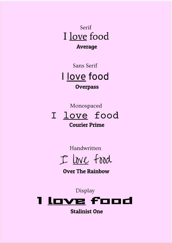 Word portraitsIn this I wrote 20 words, in 10 different fonts. The one on the left matches the font well, however, the one on the right does not. On top of the words on the right are the font names. I also followed the CRAP principle and made sure the words were aligned, and the design is also repetitive. The contrast (blue background and black fonts) work well. There is good proximity between the words as well. 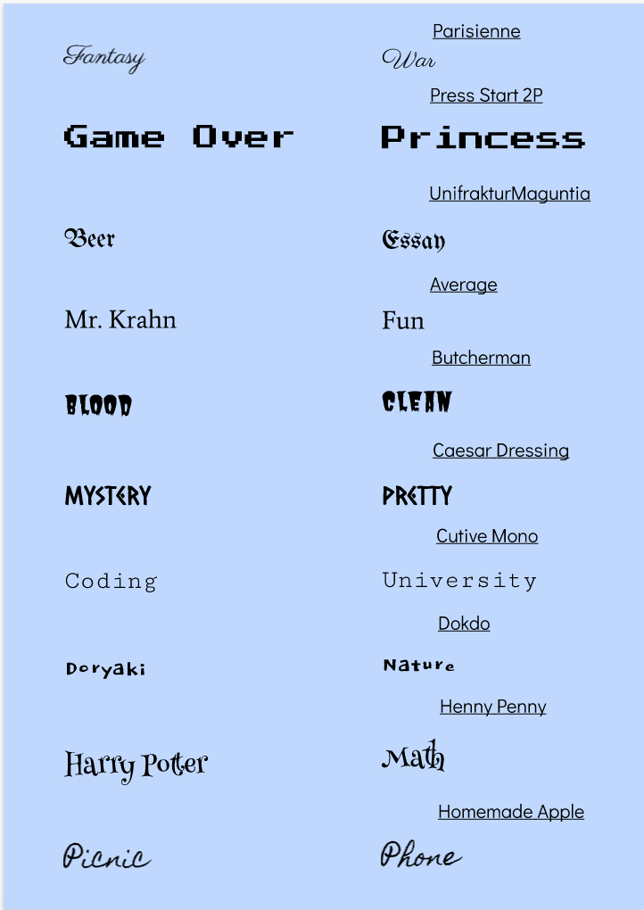
0 Comments
Leave a Reply. |
AuthorHi, I'm Nikita and welcome to my blog. Archives
February 2021
Categories
All
|

 RSS Feed
